Key Takeaways: A strong logo sets the tone for your brand — keep it simple, unique and built to last.
- Hire a professional: Avoid cheap, generic options — a quality designer ensures uniqueness and better longevity.
- Keep it simple: Logos with too much detail don’t scale well or remain memorable.
- Avoid stock art: Using pre-made graphics risks your brand looking generic and undermines originality.
- Choose a great font: The typography should reflect your brand’s character — bad font choices can ruin the impact.
- Don’t rely on colour: Your logo should work in black & white first — colour is secondary.
- Don’t copy others: A logo should represent your business — if it resembles someone else’s, it has failed.
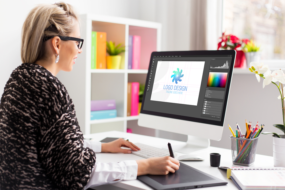
Are you in the process of designing a logo for your company? It’s a big part of starting a business, and one you need to get right. Going for the quick and easy, or cheap option could mean you end up shelling out for changes later which could end up costing you a lot of money needlessly.
Here are some top tips for getting it right the first time when it comes to logo design!
DO NOT: Use an Amateur
As with many things in life, you get what you pay for. Avoid websites that offer ridiculously cheap logo packages. A professional business should look professional, so you should try and invest some time and money into your logo. If your logo looks amateurish, then so will your business. A business should know where to look when it wants a new logo…
Here are the advantages of hiring an established and professional logo designer:
– Your logo will be unique and memorable.
– Your logo will have a longer lifespan and won’t need to be redesigned in a couple of years.
– Your logo will look professional.
– You won’t run into any problems down the line with reproducing it.
DO: Keep it Simple
Highly detailed designs don’t scale well when printed or viewed in smaller sizes. When printed in small sizes, (like on a lanyard or wristband!), a complex design will lose detail and in some cases will look like a smudge or, worse, a mistake!
The more detail a logo has, the more information the viewer has to process. A logo should be memorable, and one of the best ways to make it memorable is to keep things simple.
- A simple design is scalable and recognisable on large and small formats.
- Your logo must work on everything — from business cards to social media avatars.
- Unique design avoids brand confusion and builds recognition.
- A timeless look prevents costly redesigns and keeps your identity consistent.
DO NOT: Use Stock Art
Using stock graphics in a logo is very risky. A logo should be unique and original, and the licensing agreement should be exclusive to you: using stock art breaks both of these rules. Chances are, if you are using a stock image, it is also being used by someone somewhere else in the world, so yours is no longer unique. You can pretty easily spot stock vectors in logos because they are usually familiar shapes, such as globes and silhouettes.
DO: Take time to choose a good font
Font choice can make or break a logo. More often than not, a logo fails because of a poor font choice! Finding the perfect font for your design is all about matching the font to the style of the icon. But this can be tricky. Every typeface has a personality. If the font you have chosen does not reflect your company, then the whole message of the brand could fail!
DO NOT: Rely on colour
Without colour, a great design can lose its identity. Some people can’t wait to add colour to a design, and some rely on it completely. This is a very common mistake. Every business owner will need to display their logo in only one colour at one time or another, so the designer should test to see whether this would affect the logo’s identity. Choosing colour should be your last decision, so starting planning the design in black and white is best.
DO NOT: Be a copycat!
This is the biggest logo design mistake of all. The purpose of a logo is to represent a business, so if looks the same as someone else’s, then it has clearly failed. Copying others does no one any favours, so even if you see a design you love – do not copy it at all.
Show Off Your New Logo on Custom Printed Products
From wristbands to lanyards, bring your branding to life with high-quality promotional items your customers will actually use.


